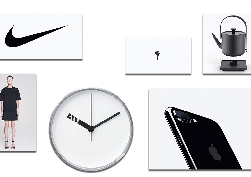
My dad once called a pair of blue scissors green. I look fatter and thinner at the same time to my relatives. A shirt you like may look hideous to your best friend. Children disagree over what they see in the clouds. Remember “the dress”?
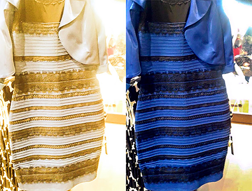
In September 2016, the iPhone 7 was released, introducing a new colour: Jet Black. The sleek, shiny body is almost mouth-watering. A thin, black slab of metal, starting at $649.
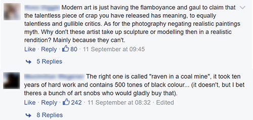
Around the same time, I found this Facebook post captioned: Art, then and now. Then is a photo of a Renaissance-looking painting, Now is a black canvas, presumably Ad Reinhardt’s Abstract Painting. Abstract Painting got much flak in the comments.
But Abstract Painting is more than a black canvas. MoMA’s entry on this piece reads: “At first glance, Abstract Painting may appear to be a monochromatic black canvas, but a careful look reveals that this painting is a three-by-three grid with squares in varying shades of black.” Reinhardt mixed small amounts of red, green, or blue with black to create the different shades. He wanted to achieve an object that is “aware of no thing but art.”
This intention is lost to the audience on Facebook, instead garnering criticism for its apparent lack of skill and/or creativity in the conventional sense.
Meanwhile, the Jet Black iPhone 7 was sold out within minutes despite how easy it is to retain scratch marks.
Why do people have contrasting perceptions of two very similar-looking things? It seems there should be an obvious answer, but I found more than I expected by pursuing this line of thought.
Minimalism, art, and design
Minimalism often refers to anything which is spare or stripped to its absolute essentials (VanEenoo, 2011). It is a method of creation that results in ease of use due to its simplicity and cleanliness. Therefore, many user-centred designs apply the principles of minimalism to their systems.
Minimal Art is the term used to describe minimalism specifically in visual arts (Marzona and Grosenick, 2004). The artists of the time did not like the label minimalism since it negatively implies that their work was devoid of art content (Dempsey, 2002). Minimal Art represents nothing but itself—no associations with religion, history, or anything else. Minimal Art offers the pure experience of looking.
Art and design are similar, but the difference lies in their content. Art sparks different messages around its meaning, while design needs to deliver a specific intended message to the audience. Unintended messages in design can be dangerous.


Perception and function
I conducted an online survey to gather data, showing two images: a Jet Black iPhone 7, and a Minimal painting.
First, I asked whether respondents knew the functionof each item. 66.7% knew the function of the iPhone. Then, I asked if the two items are visually similar. 88.6% answered “yes” and stated the aspects of similarity, among which colour and plainness were addressed the most.
To test how they value the items, I asked if they would purchase them. Half were only willing to buy the phone, and only 3.5% would buy the painting. Various reasons were stated: already having a phone, liking the colour black, but the most prevalent comments surrounded function. Several answers revealed they would not buy the iPhone because the standard earphone jack is removed in this model. Others said that they find the painting unattractive, hence they would not purchase it.
People value things they find functional. When money is involved, other aspects of the object (e.g. its aesthetic appearance) are less important. One respondent said, “No one would buy the black painting if I tried to resell it because it’s just a black painting”.
When asked if they think the painting is art, half of the respondents answered “yes”. 28.9% aren’t sure, and 18.4% think it’s rubbish. When the latter group is presented with a list of what art should be, most of them chose “Have cultural, social, or political background”. The second and third most selected options were “decorative” and “detailed”, respectively.
Minimal Art lacks association with religion, history, etc. Does that mean that art by itself, without associations, is ‘rubbish’?
According to my interviewee, Datin Shalini Ganendra, ‘liking’ or ‘relating to’ an artwork aesthetically is natural, but appreciation is informed. “Every art movement has a place in art history and should be understood in that context,” she writes.
While minimalist design is clearly appreciated, is Minimal Art really useless? Considering art history, it’s not that simple. Its function might not be practical, but Minimal Art breaks the norm that art needs to possess things outside itself: the artist’s emotion, historical event, etc. Artists produced a piece of art for what art is, making the signifier the signified, possibly eliminating semiotics in art. Minimalism producing Minimal Art changes the perception of art from art with non-artistic association to art as it is.
Preference and appreciation
Rahman (2014) researched that preferences in visual arts widely vary among people because of differing influencing factors, such as geographical area, education, economic background, and life experiences.
Oftentimes, one prefers something over the other because it looks more beautiful. Humanity appreciates beauty, but beauty is preference, as proven by different standards of beauty across cultures. Although beauty can generally be agreed upon, a uniformized opinion is not achievable when talking about, say, a shirt. Aesthetic preference is diverse.
Beauty is not only skin deep. The Oxford Dictionary (2017) defines aesthetic as a branch of philosophy that studies the nature of art, beauty, and taste. When an object of art is being studied in the matter of aesthetics, aesthetic judgement turns into artistic judgement. It’s close to art appreciation—the ability to appreciate art based on knowledge of visual culture.
Berger (2008) wrote, “The way people see things is affected by what they know or believe.” Both preference and appreciation are affected—the only difference is the nature of said knowledge or belief. Appreciation is learnt: history can help one understand and appreciate art or design. Preference tends to be shaped by informal knowledge sources, depending on one’s social class or neighbourhood, for example.
Design and function are inseparable; thus, design appreciation involves the balance of form and function. With design, viewers may position themselves as users to gather information of the design’s usability, helping them to better understand and appreciate design.
Appreciation disregards preference — one can appreciate art or design without liking how it looks. If you are interested in learning about the process behind perceiving art, I suggest reading A Model of Aesthetic Appreciation and Aesthetic Judgement by Leder et al. (2004).
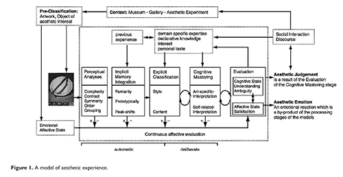
As written by Acton (2004), art and design appreciation are important because they require critical thinking and analysis, an advantageous habit if practiced frequently. The mind’s database is expanded, proven by Leder et al.’s model. Instead of ending at one point, it forms a cycle—knowledge that you gain from your aesthetic judgement is recycled, contributing to the beginning of a new round of perceiving.
Appreciating art and design also increases the viewer’s understanding for the diversity of ideas. This outcome of appreciation is not exclusive to practicing designers and artists only. People in general may benefit from appreciation by gaining heightened empathy. In the act of appreciation, viewers disconnect their preference and focus on how and why the work is created as it is, leading them closer to the creator’s perspective. Empathy is when one accepts the work without attaching it to personal preference — a form of emotional intelligence that is much needed in life.
Conclusion
To appreciate or criticize, one must understand. To understand, one must see. How people see is affected by many factors that result in diverse ways of seeing.
The difference between how people see minimalism in art and design is caused by seeing functionality. If one fails to see the presence of functionality in an object, one cannot proceed to understand and appreciate said object. However, the rift between art and design is caused exactly by functionality: design must be practically functional, and the significance of practical functionality in our lives unfortunately bleeds in when we observe art as well.
It’s always been about us, so when Minimal Art doesn’t tell us the things Da Vinci or Monet does, and doesn’t look like Mona Lisa or water lilies, its most common function—decorativeness—along with the convention of art with non-artistic associations, is absent. Consequently, we deem it useless.
Appreciation involves not only hard facts, but also the ability to switch perspectives. It doesn’t have anything to do with ‘liking’. The object is in focus, not you. The only exception is design appreciation, where your experience as a user can be the focus.
I hope that distinguishing preference from appreciation helps us see things better. The next time you think something is ‘rubbish’, remember this and think again, but with a different lens—you might learn a lot from it.

