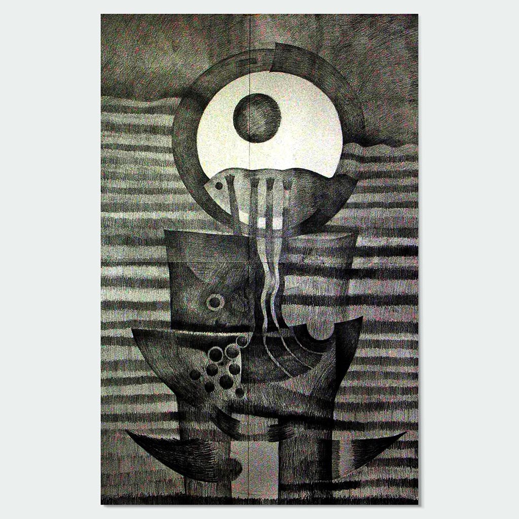
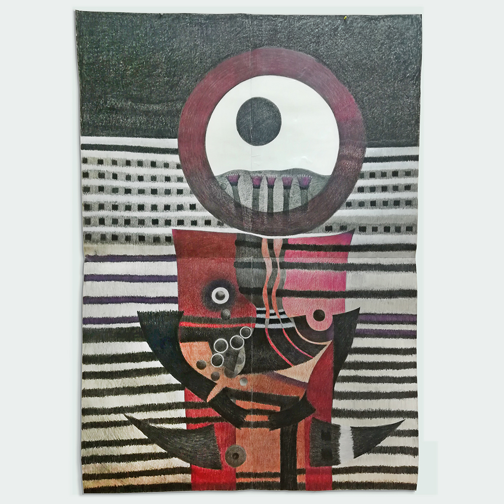
I will begin by defining a few terms used in this narrative before explaining the mechanisms by which I developed the black and white drawing above to the color final at the end of the article.
Historically, the human activity of mark making (drawing, sketching) has served to describe or represent a sort of visual language that attempts to help us make sense of the world around us as well as leaving our mark for future generations, recording our lifetime, culture, and the development of the human mind. Drawing as a written language has been used through-out the millennia, prehistoric man used burned pieces of wood, or a red powder probably from the surrounding stones, to draw lines and make marks on the walls of their dwellings. They wanted to record their existence and lives. This desire resides in the deepest part of our human DNA. This human activity is part of our sense of human mortality; it serves our ability to perceive or think visually. The Greeks technical contribution was to develop a rough idea of linear perspective and through the use of color, the depth of field. Though they had not evolved as the Renaissance masters, their attempt is well recorded on the in-house floor mosaics, pottery, and relief sculpture. Great artists, designers, men of science and religion used drawing to advance human knowledge. Drawing has been applied to and used by arts, science, and technology.
From 1999 to 2011, while working as an academic in a private local university, I produced a series of drawings in monochromatic tones of black and white. This set of drawings were produced using various dry materials such as graphite pencil with varying softness such as 2B, 4B, 6B, 9B; natural charcoals made of willow trees or rouse stick; hard compress charcoal; semi-oily charcoal sticks, and Lomo-graph pencil to draw on smooth surfaces such a glass. The watercolor paper used for all this series of drawings were of differing qualities such as hot/cold press, of various sizes and thickness as well as cartridge paper with a hot-press smooth surface with almost no tooth whereby water media dries faster.
What are the differences between the black and white drawing below compared to colored drawing thereafter? The differences reside in the way the drawing is composed. The fact is that the human mind focuses on the contrast between the foreground and the background separating the images simultaneously. There is a difference between how we see, and what we see. How we see is psychological. It is our capacity to sum-up all our knowledge, including that which sits deep in the subconscious. Memory and knowledge add to the visual and help the creative artist reveal the inner truth of the subject.

I started out the drawing above in black and white tones at beginning of 2007 while working in a private university. I wanted to create a worshiping totem like a Peruvian Kero (a cup shaped object for drinking Chicha, a local corn juice). In the lower part of the drawing, I included a circle, off the center, at the upper part of the paper with waving lines crossing in horizontal motion along with a heavy top section in black tone behind the circle. I chose four pieces of paper in order to create one large scale drawing sub-divided into four sections. These four pieces of paper together generate an arrangement that is energetic and exciting.
It took several months to work out the final composition; drawn on a large white piece of paper generated challenges and fears in which the scaling of the forms, created tones and contrast that highlight the focus areas. They create an inner sense of tension between the parts — a separation of figure and ground. The subsequent stage worked out tones and shades that would add meaning to these forms previously established during the developmental stage. The aim, to create high contrast, separated the figure (circle and other elements in the upper and lower part of the paper) from the background (the white surrounding area). I used personal symbolism to create this drawing which is divided into four sections, the upper and lower, and left and right areas.
In the upper section, the large circle representing the sun in white while the inner small-scale circle represents the moon in black, both drawn together as one against a large black upper structure that represents the sky. In the lower section, which is the ground, appears a block like structure representing a cup-like form that weaves lines across that represent the water.
It took me a couple of years to work out this drawing. My drawings in general do not follow any pre-conceived idea of composition. These drawings appear in my mind one by one, and all this happens while working on the drawing. The paper format is important. The rectangle, whether vertical or horizontal, with other elements of composition will determine the outcome.

This drawing in black and white has reached a final stage that I fix with a spray fixative for drawings. This procedure among artists is common as it helps to keep the drawing permanently on the paper surface
Unfortunately, after several years of being stored, the drawing was damaged by humidity and natural moisture. I managed to transfer it to a new and more resilient paper surface.
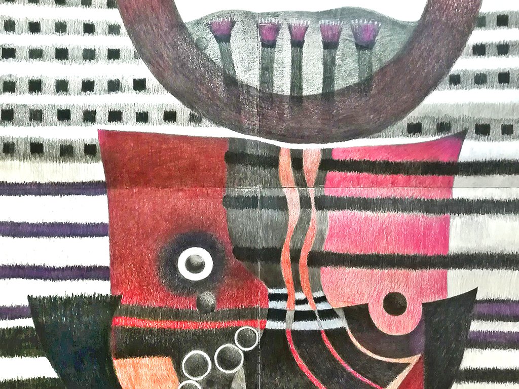
Each piece of the original paper is cartridge 180 grams, hot-press (semi-acid free) which I transferred with glue onto a new watercolor paper 180 grams acid free. I then allowed it to hang on my studio wall to dry for a couple of months. In the meantime, I was able to study and observe it, thinking and re-thinking the best possible set of suitable colors that would further enhance the drawing. Looking again at the black and white drawing, I decided that red, brown, violet, white, and blacks would be suitable.
Based on the original black and white drawing, I decided to follow my intuition and years of experience to make my final decisions which did not follow any pre-determinate solution or set of rules but is based instead on years of skill, experience, visual knowledge, and innumerable tries.
Cognitive analysis allows the artist to make the best possible imaginary studies before implementing them. The color arrangement aims to create a strong, energetic, and vigorous visual outcome. They depict a hidden meaning difficult to justify, leaving the final understanding of this visual language that allow viewers to reach to their own conclusions

